HiDO Website & Rebranding
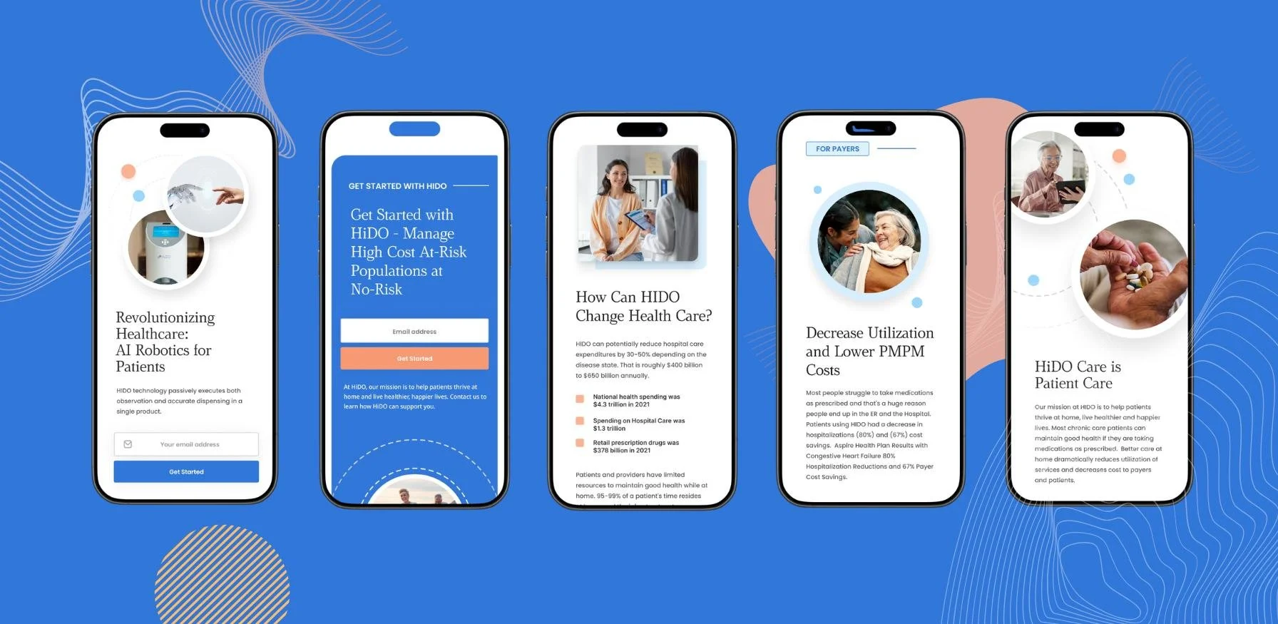
I designed HiDO Health's website from the ground up to communicate a complex healthcare solution in a clear and accessible way. The experience was built around multiple stakeholder groups—including patients, caregivers, providers, and payers—while emphasizing clinical outcomes, cost savings, and patient-centered care. Through a combination of strong visual hierarchy, evidence-based storytelling, and healthcare-focused branding, the website establishes trust, highlights measurable impact, and supports business growth through strategic conversion points.
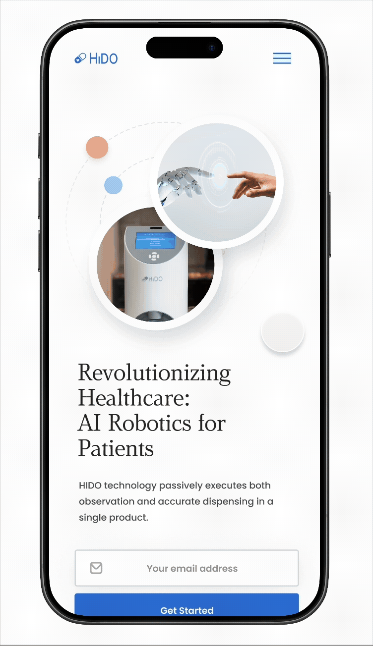
Healthcare-Focused Visual Language
The design uses a clean, clinical aesthetic with soft blue tones, white space, and healthcare imagery to immediately establish trust and credibility. The visual style aligns with the medical technology industry while remaining approachable for patients, caregivers, providers, and payers.
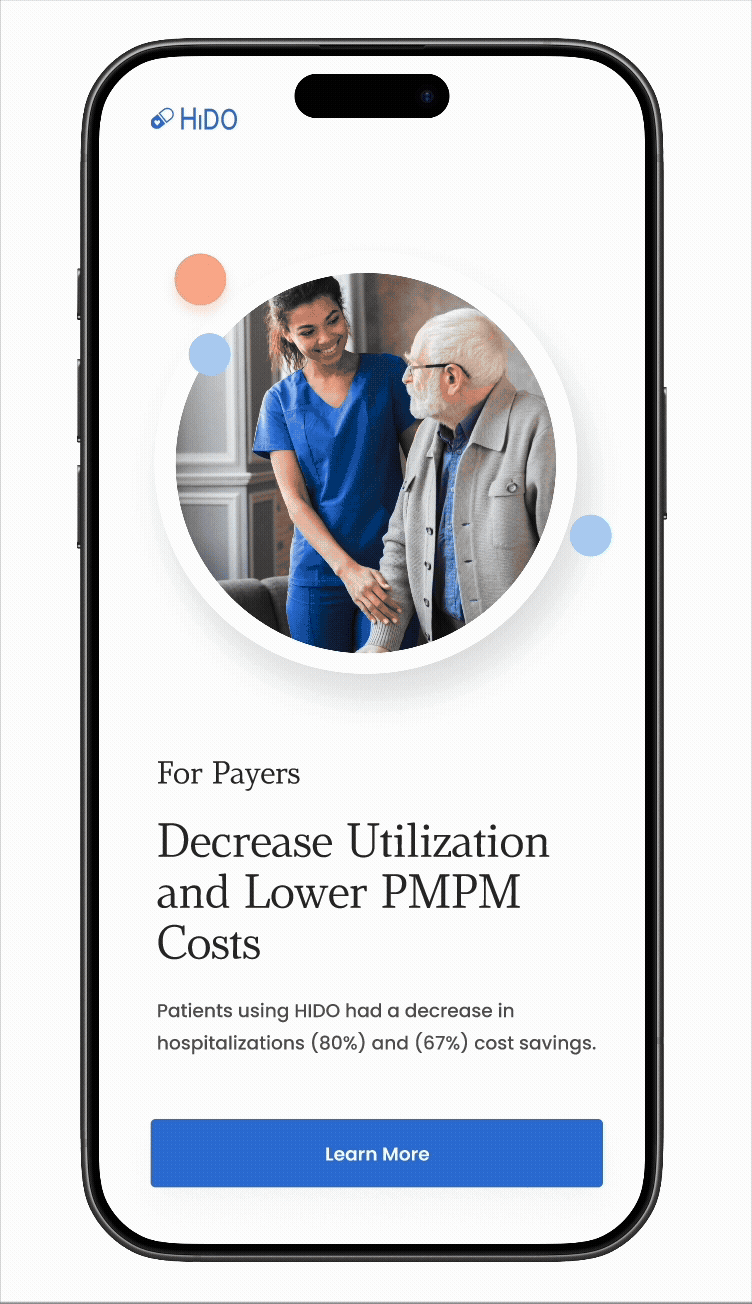
Audience-Specific Information Architecture
The design balances technology and human care by combining:
Patient and caregiver photography
Healthcare professional imagery
Medical device visuals
This reinforces HiDO's mission of improving patient outcomes through technology rather than making the product feel purely technical.
Human-Centered Imagery
he website is structured around HiDO's primary stakeholders:
Patients & Caregivers
Healthcare Providers
Payers
Each audience receives tailored messaging and content, making it easier to understand the value proposition relevant to their needs.